








Veuve Clicquot Vintage Champagne Poster by Arnold van Roessel, 1900
Obra de arte auténtica
La obra de arte que imprimimos se restaura fielmente a partir de la fuente original, normalmente un museo, biblioteca o colección privada. Nunca sustituimos, redibujamos ni inventamos la obra del artista utilizando IA generativa.
Restaurada en nuestro taller de Londres a partir de la obra original de 1900 e impresa en calidad museo. Descripción completa
La oferta del coleccionista
Elija dos obras elegibles y obtenga un 20 % de descuento en ambas. Elija tres y la de menor precio será gratuita, con un ahorro máximo del 33 %.
Combine y mezcle mapas estándar elegibles y reproducciones de bellas artes. No se requiere código; la oferta se aplica automáticamente al finalizar la compra.
Se incluyen las configuraciones estándar hechas por encargo. Quedan excluidos los tamaños a medida, los diseños personalizados y los trabajos por encargo.
¿Necesita entrega en diferentes direcciones? Contáctenos antes de realizar el pedido.La oferta del coleccionista
Elija dos obras elegibles y obtenga un 20 % de descuento en ambas. Elija tres y la de menor precio será gratuita, con un ahorro máximo del 33 %.
Combine y mezcle mapas estándar elegibles y reproducciones de bellas artes. No se requiere código; la oferta se aplica automáticamente al finalizar la compra.
Se incluyen las configuraciones estándar hechas por encargo. Quedan excluidos los tamaños a medida, los diseños personalizados y los trabajos por encargo.
¿Necesita entrega en diferentes direcciones? Contáctenos antes de realizar el pedido. Restaurado en Londres • Impreso y enmarcado en Australia
Obra de arte auténtica
La obra de arte que imprimimos se restaura fielmente a partir de la fuente original, normalmente un museo, biblioteca o colección privada. Nunca sustituimos, redibujamos ni inventamos la obra del artista utilizando IA generativa.
Restaurado a partir de la obra original de 1900 e impreso en calidad museo. Descripción completa
Elige el formato
Elige el acabado


(Más información)
Mensaje de regalo y acabado personalizado

Si deseas agregar un mensaje de regalo, o un acabado (rompecabezas, tablero de aluminio, etc.) que no esté disponible aquí, por favor solicítalo en la "nota del pedido" cuando realices la compra.
Cada pedido es hecho a medida, así que si necesitas que el tamaño se ajuste ligeramente, o que se imprima en un material inusual, háznoslo saber. Hemos realizado miles de pedidos personalizados a lo largo de los años, así que hay (casi) nada que no podamos gestionar.
También puedes contactarnos antes de hacer tu pedido, ¡si lo prefieres!
La elección de coleccionistas, diseñadores y quienes buscan un regalo especial
Más de 8.000 reseñas de 5 estrellas

Champagne Veuve Clicquot, published in 1900 from an 1883 design by the Dutch artist Arnold van Roessel, presents luxury through a remarkably...
Seguir leyendoChampagne Veuve Clicquot, published in 1900 from an 1883 design by the Dutch artist Arnold van Roessel, presents luxury through a remarkably economical arrangement of lettering, colour and objects. Against a deep red ground, the pale words ‘CHAMPAGNE’ and ‘VEUVE CLICQUOT’ command the composition, while a dark bottle rises from an ice bucket beside two waiting glasses. Cream, black and gold-toned accents temper the intensity of the red, giving the poster both immediate impact and an air of ceremony.
Van Roessel’s design belongs to a period in which the advertising poster was becoming an increasingly distinctive form of public art. Commercial images had to be legible at a glance, memorable at a distance and persuasive without lengthy explanation. Here, the product is presented not simply as a bottle but as the centre of a carefully staged occasion. Veuve Clicquot’s established association with Champagne gives the design its subject; Van Roessel’s contribution is to translate that reputation into a concise visual language of abundance, polish and anticipation.
A closer look
The eye first meets the broad, rounded letters at the top. Their pale colouring stands sharply against the saturated background, while the decorative outline around them increases their graphic weight. ‘CHAMPAGNE’ announces the category before ‘VEUVE CLICQUOT’ identifies the house below, creating a clear hierarchy that can be understood almost instantly. Rather than competing with the illustration, the typography forms part of the architecture of the poster, enclosing the central objects within a strong vertical rhythm.
Below the lettering, the black bottle provides the composition’s darkest and most emphatic shape. Its upright silhouette is set into the lighter ice bucket, whose highlights suggest a reflective metallic surface despite the poster’s largely flat treatment of colour. Two slender glasses occupy the lower right, their fine rims and stems offering a delicate counterpoint to the bottle’s mass. Their placement is especially effective: empty and poised for use, they introduce the suggestion of an imminent pour without requiring a figure or narrative scene.
An ornamental lantern-like form in the upper left adds a more intricate note. Its curling dragon motif contrasts with the poster’s otherwise broad outlines and simplified shapes, rewarding closer attention without disturbing the clarity of the central message. Across the design, minimal shading preserves a crisp, graphic character. Depth is created less through naturalistic modelling than through overlap—the bottle within the bucket, the glasses set alongside it—and through the controlled alternation of dark forms and pale lettering against red.
Context and significance
By the end of the nineteenth century, posters had become a conspicuous part of modern urban visual culture. Improvements in commercial reproduction and the growth of branded consumer goods encouraged artists and designers to develop images that could combine information with decorative appeal. Beverage advertising was particularly suited to this language: a name, a bottle and the accessories of serving could evoke sociability and refinement with exceptional economy.
Van Roessel’s design demonstrates how effectively such posters blurred the boundary between illustration and graphic design. The composition does not depend on a detailed setting, fashionable figures or an elaborate anecdote. Instead, bold lettering, a restricted palette and a handful of carefully chosen objects turn the Veuve Clicquot name into the visual focus. The result retains the directness of an advertisement while offering the balance, line and chromatic assurance that made turn-of-the-century poster design an art form in its own right.
Choosing the right size and finish
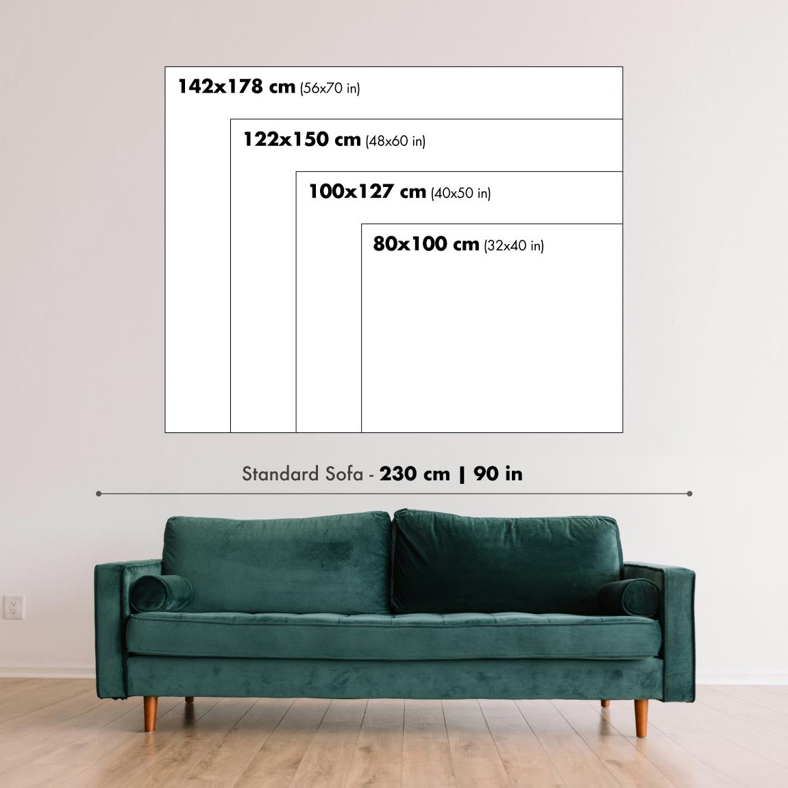
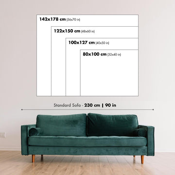
Artwork can feel intimate at smaller sizes and dramatically more architectural at larger ones. Use the room preview, model image and size guide to see how the proportions and scale will work in your space.
If you need an exact size, specialist framing or help planning a larger display, ask our workshop for advice.
The model in the listing images is holding the 18x24in (45x60cm) version of this art print.
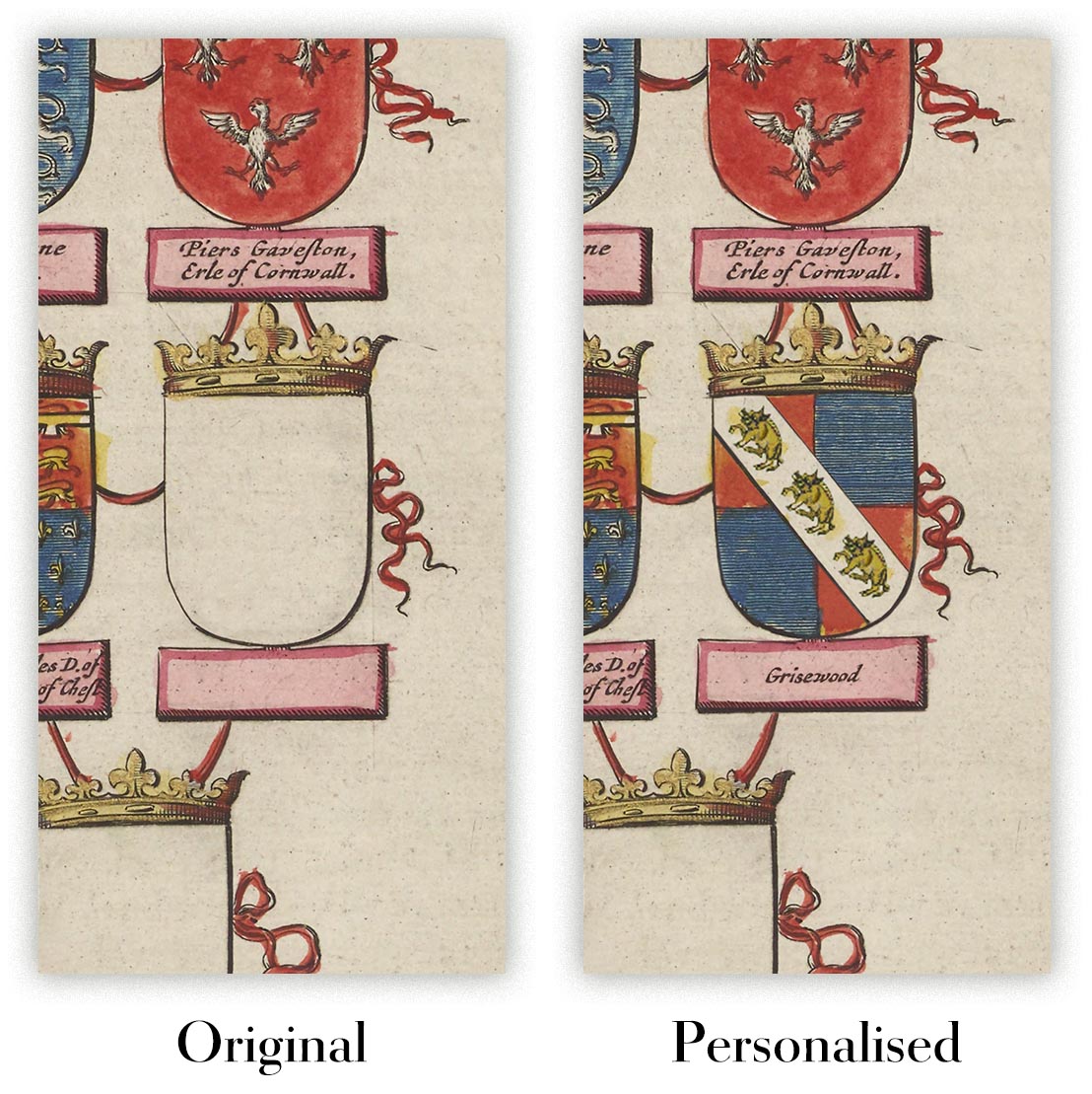
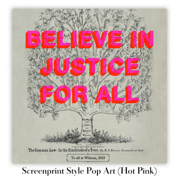
Where personalisation is available, you can add a short title or dedication, or one considered visual detail. See examples of personalised artwork.
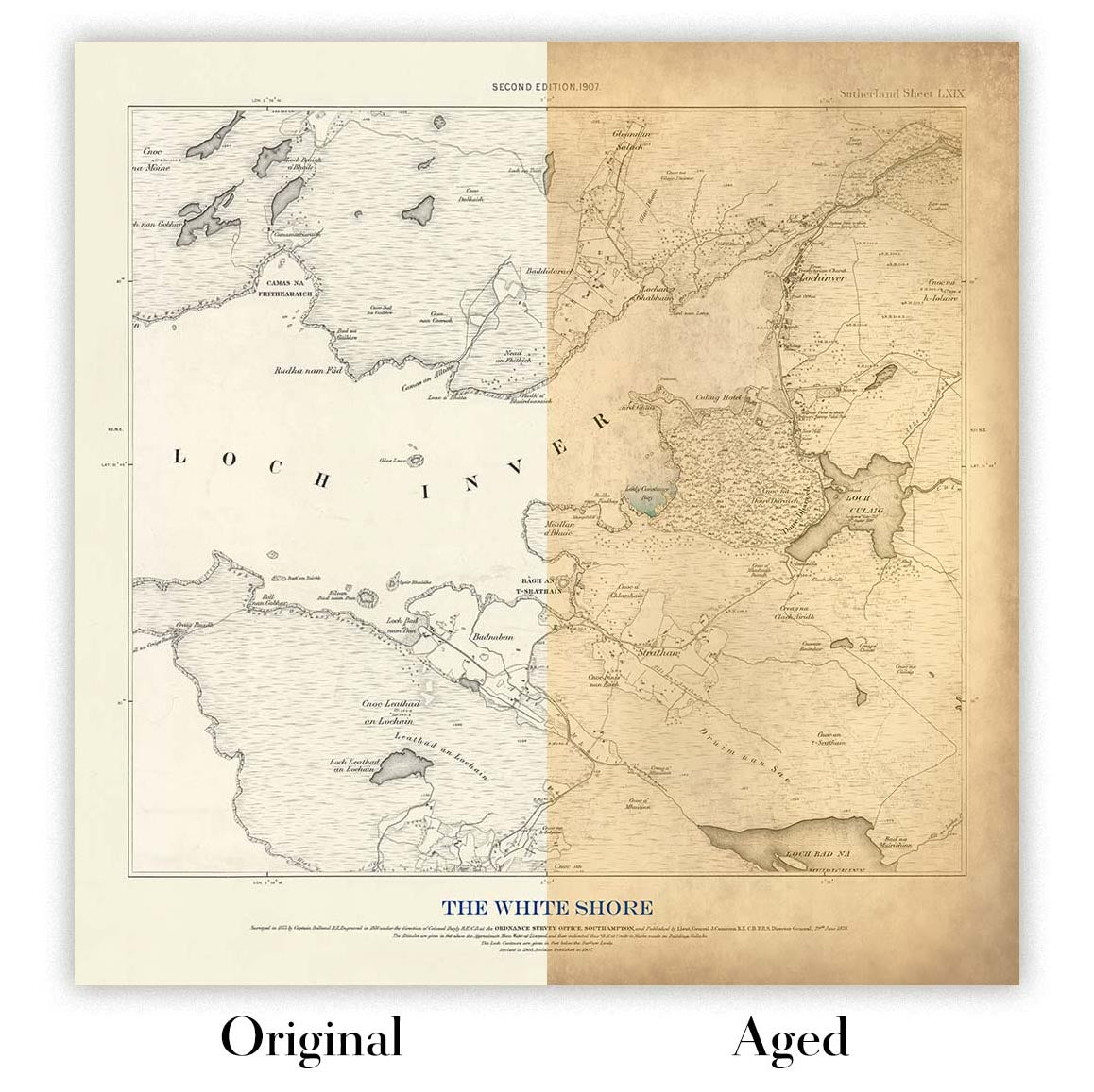
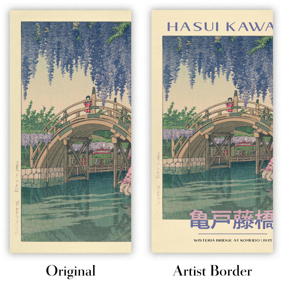
Choose Original to retain the colour and character of the source artwork, or Aged for a warmer, more antique appearance. See examples of our Aged artwork.
Every piece is produced to archival standards using fade-resistant pigment inks on acid-free matte art paper. Choose an art print, framed art print or framed canvas using the finish options above.
Framed art prints use crystal-clear optical acrylic for excellent clarity, lower weight and safer delivery than glass. Each piece arrives professionally framed and ready to hang.
Selected artworks can be produced at statement sizes up to 3 metres (10ft). Custom sizing and specialist framing are also available. If the exact option you need is not listed, contact our workshop.
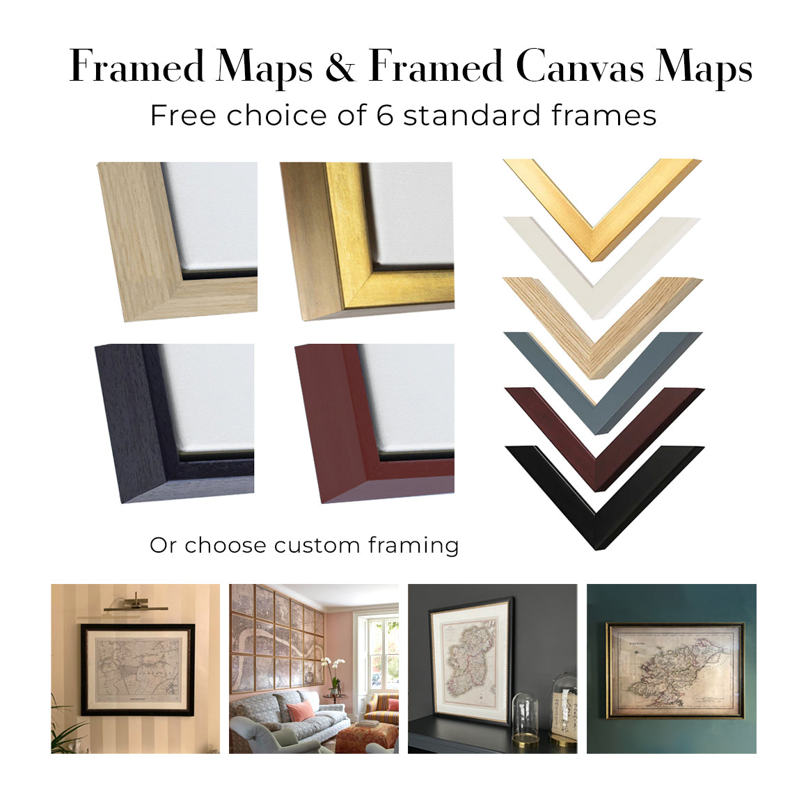
This artwork is also available as a float framed canvas, sometimes known as a shadow gap framed canvas or canvas floater. The work is printed on artist's cotton canvas and then stretched over a handmade box frame. We then "float" the canvas inside a wooden frame, which is available in a range of colours (black, dark brown, oak, antique gold and white). This is a wonderful way to present an art print without glazing in front. See some examples of float framed canvas art and explore the differences between my different finishes.
Champagne Veuve Clicquot, published in 1900 from an 1883 design by the Dutch artist Arnold van Roessel, presents luxury through a remarkably economical arrangement of lettering, colour and objects. Against a deep red ground, the pale words ‘CHAMPAGNE’ and ‘VEUVE CLICQUOT’ command the composition, while a dark bottle rises from an ice bucket beside two waiting glasses. Cream, black and gold-toned accents temper the intensity of the red, giving the poster both immediate impact and an air of ceremony.
Van Roessel’s design belongs to a period in which the advertising poster was becoming an increasingly distinctive form of public art. Commercial images had to be legible at a glance, memorable at a distance and persuasive without lengthy explanation. Here, the product is presented not simply as a bottle but as the centre of a carefully staged occasion. Veuve Clicquot’s established association with Champagne gives the design its subject; Van Roessel’s contribution is to translate that reputation into a concise visual language of abundance, polish and anticipation.
A closer look
The eye first meets the broad, rounded letters at the top. Their pale colouring stands sharply against the saturated background, while the decorative outline around them increases their graphic weight. ‘CHAMPAGNE’ announces the category before ‘VEUVE CLICQUOT’ identifies the house below, creating a clear hierarchy that can be understood almost instantly. Rather than competing with the illustration, the typography forms part of the architecture of the poster, enclosing the central objects within a strong vertical rhythm.
Below the lettering, the black bottle provides the composition’s darkest and most emphatic shape. Its upright silhouette is set into the lighter ice bucket, whose highlights suggest a reflective metallic surface despite the poster’s largely flat treatment of colour. Two slender glasses occupy the lower right, their fine rims and stems offering a delicate counterpoint to the bottle’s mass. Their placement is especially effective: empty and poised for use, they introduce the suggestion of an imminent pour without requiring a figure or narrative scene.
An ornamental lantern-like form in the upper left adds a more intricate note. Its curling dragon motif contrasts with the poster’s otherwise broad outlines and simplified shapes, rewarding closer attention without disturbing the clarity of the central message. Across the design, minimal shading preserves a crisp, graphic character. Depth is created less through naturalistic modelling than through overlap—the bottle within the bucket, the glasses set alongside it—and through the controlled alternation of dark forms and pale lettering against red.
Context and significance
By the end of the nineteenth century, posters had become a conspicuous part of modern urban visual culture. Improvements in commercial reproduction and the growth of branded consumer goods encouraged artists and designers to develop images that could combine information with decorative appeal. Beverage advertising was particularly suited to this language: a name, a bottle and the accessories of serving could evoke sociability and refinement with exceptional economy.
Van Roessel’s design demonstrates how effectively such posters blurred the boundary between illustration and graphic design. The composition does not depend on a detailed setting, fashionable figures or an elaborate anecdote. Instead, bold lettering, a restricted palette and a handful of carefully chosen objects turn the Veuve Clicquot name into the visual focus. The result retains the directness of an advertisement while offering the balance, line and chromatic assurance that made turn-of-the-century poster design an art form in its own right.
Choosing the right size and finish
Artwork can feel intimate at smaller sizes and dramatically more architectural at larger ones. Use the room preview, model image and size guide to see how the proportions and scale will work in your space.
If you need an exact size, specialist framing or help planning a larger display, ask our workshop for advice.
The model in the listing images is holding the 18x24in (45x60cm) version of this art print.
Where personalisation is available, you can add a short title or dedication, or one considered visual detail. See examples of personalised artwork.
Choose Original to retain the colour and character of the source artwork, or Aged for a warmer, more antique appearance. See examples of our Aged artwork.
Every piece is produced to archival standards using fade-resistant pigment inks on acid-free matte art paper. Choose an art print, framed art print or framed canvas using the finish options above.
Framed art prints use crystal-clear optical acrylic for excellent clarity, lower weight and safer delivery than glass. Each piece arrives professionally framed and ready to hang.
Selected artworks can be produced at statement sizes up to 3 metres (10ft). Custom sizing and specialist framing are also available. If the exact option you need is not listed, contact our workshop.
This artwork is also available as a float framed canvas, sometimes known as a shadow gap framed canvas or canvas floater. The work is printed on artist's cotton canvas and then stretched over a handmade box frame. We then "float" the canvas inside a wooden frame, which is available in a range of colours (black, dark brown, oak, antique gold and white). This is a wonderful way to present an art print without glazing in front. See some examples of float framed canvas art and explore the differences between my different finishes.
Muchos de nuestros mapas y reproducciones de arte se eligen como regalos considerados para hogares, oficinas, despachos y lugares significativos.
Elija una opción enmarcada para el regalo más sencillo, listo para colgar, o elija una lámina sin enmarcar si el destinatario prefiere seleccionar su propio marco.
Producimos los pedidos localmente en 23 países de todo el mundo, por lo que a menudo los regalos pueden realizarse cerca del destinatario. Esto ayuda a que lleguen más rápido, viajen de forma más segura y eviten sorpresas por aduanas o aranceles de importación.
- Podemos entregar directamente al destinatario
- Las piezas enmarcadas llegan listas para colgar
- Las láminas sin enmarcar se embalan cuidadosamente en un resistente tubo protector
- Casi todos los pedidos se producen localmente, para regalar de forma más rápida y segura
- Las devoluciones de 90 días dan al destinatario tiempo para decidir
Si no está seguro de qué elegir, por favor contáctenos. Podemos ayudarle a escoger el mapa, tamaño, acabado u opción de entrega adecuados.
Para la mayoría de los pedidos, el tiempo de entrega es de aproximadamente 3 días laborables. Los productos personalizados y a medida tardan más, ya que tengo que hacer la personalización y enviártelo para su aprobación, lo cual suele tardar 1 o 2 días.
Tenga en cuenta que los pedidos enmarcados muy grandes suelen tardar más en fabricarse y entregarse.
Si necesitas que tu pedido llegue para una fecha determinada, por favor contáctame antes de hacer el pedido para que podamos encontrar la mejor manera de asegurarnos de que recibas tu pedido a tiempo.
Imprimo y enmarco mapas y obras de arte en 23 países alrededor del mundo. Esto significa que tu pedido se fabricará localmente, lo que reduce el tiempo de entrega y asegura que no se dañe durante el envío. Nunca pagarás aranceles de aduana o impuestos de importación, y pondremos menos CO2 en el aire.
Todos mis mapas y impresiones artísticas están bien empaquetados y enviados en un tubo resistente si no están enmarcados, o rodeados de espuma si están enmarcados.
Intento enviar todos los pedidos dentro de 1 o 2 días después de recibir tu pedido, aunque algunos productos (como mascarillas, tazas y bolsas de tela) pueden tardar más en fabricarse.
Si seleccionas Entrega Exprés al finalizar la compra, priorizaremos tu pedido y lo enviaremos por mensajería de 1 día (Fedex, DHL, UPS, Parcelforce).
La entrega al día siguiente también está disponible en algunos países (EE. UU., Reino Unido, Singapur, EAU), pero por favor intenta hacer tu pedido temprano en el día para que podamos enviarlo a tiempo.
Mi marco estándar es un marco de madera de fresno negro estilo galería. Es simple y tiene un aspecto bastante moderno. Mi marco estándar tiene alrededor de 20 mm (0.8 in) de ancho.
Utilizo acrílico super claro (perspex/acrylite) para el vidrio del marco. Es más ligero y seguro que el vidrio, y se ve mejor, ya que la reflectividad es menor.
Seis colores de marco estándar están disponibles de forma gratuita (negro, marrón oscuro, gris oscuro, roble, blanco y oro antiguo).El enmarcado y montaje/matizado personalizado está disponible si buscas algo diferente.
La mayoría de los mapas, arte e ilustraciones también están disponibles como un lienzo enmarcado. Utilizamos lienzo de algodón mate (no brillante), lo estiramos sobre un marco de madera de caja de origen sostenible, y luego 'flotamos' la pieza dentro de un marco de madera. El resultado final es bastante hermoso, y no hay cristal que se interponga.
Todos los marcos se proporcionan "listos para colgar", con una cuerda o soportes en la parte posterior. Los marcos muy grandes tendrán placas de colgar de alta resistencia y/o un listón de montaje. Si tienes alguna pregunta, por favor ponte en contacto.
Mira algunos ejemplos de mis mapas enmarcados y mapas en lienzo enmarcados.
Alternativamente, también puedo proporcionar mapas antiguos y obras de arte en lienzo, tablero de espuma, papel de algodón y otros materiales.
Si deseas enmarcar tu mapa o obra de arte tú mismo, por favor lee mi guía de tamaños primero.
Trabajamos con diseñadores de interiores, empresas de hostelería, profesionales inmobiliarios, oficinas y compradores corporativos en piezas individuales y proyectos coordinados de mayor envergadura.
Esta obra puede adaptarse a una pared, estancia o proyecto concretos, y nuestro taller puede ayudar a coordinar las dimensiones, el material y el enmarcado antes de la producción.
- Dimensiones exactas, sobredimensionadas y a medida
- Enmarcado, montaje y materiales alternativos personalizados
- Piezas coordinadas para varias estancias o ubicaciones
- Personalización de la obra, para ajustar el color y el estilo de la pieza
- Asesoramiento sobre la obra y el enmarcado por parte de nuestro taller
- Producción local para proyectos en todo el mundo
Cada impresión artística restaurada comienza con la obra original del artista; nunca con un reemplazo generado por IA.
Nuestro estudio de Londres trabaja a partir de material de origen cuidadosamente seleccionado de museos, bibliotecas, archivos y colecciones privadas. Restauramos el deterioro por el paso del tiempo, la coloración desvaída y las imperfecciones de reproducción, preservando al mismo tiempo la composición, la pincelada, el trazo, la textura y el carácter de época del artista.
No utilizamos IA generativa para redibujar, reinterpretar ni inventar la obra. La restauración digital se emplea únicamente para recuperar y reproducir la obra original con la mayor fidelidad posible.
Una vez restaurada, la obra maestra se prepara para el tamaño y el acabado que haya elegido. Después, su pieza se imprime y, cuando se selecciona, se enmarca cerca de su destino de entrega.
Nuestras impresiones artísticas giclée utilizan papel mate de archivo libre de ácido de 200 g/m² y tintas de pigmento resistentes a la decoloración para ofrecer un acabado rico, de calidad museística. Las impresiones artísticas enmarcadas utilizan acrílico óptico cristalino y llegan listas para colgar.
También están disponibles ediciones en lienzo enmarcado y ediciones especiales sobre algodón-rag. Obtenga más información sobre nuestros materiales y acabados.
Llevamos restaurando y produciendo mapas y láminas artísticas desde 1984, y respondemos por cada pieza.
Todos los pedidos están cubiertos por nuestra garantía de 10 años y nuestra garantía de entrega sin daños. Si su pieza llega dañada, la sustituiremos o la volveremos a producir sin cargo alguno. Si cualquier otro aspecto no es correcto, contacte con nuestro equipo de taller y lo resolveremos con prontitud.
Consulte nuestra política de devoluciones y reembolsos para conocer todos los detalles.


