










Angelus Vintage Liqueur Poster by Leonetto Cappiello, 1911
Authentic artwork
The artwork we print is faithfully restored from the original source - usually a museum, auction house or private collection.
We never replace, redraw or invent the artist’s work using generative AI.
Restored in our London workshop from the original 1911 artwork and printed to museum-grade archival standards. Full description
The Collector’s Offer
Choose two eligible works and receive 20% off both. Choose three and the lowest-priced one is complimentary, a maximum saving of 33%.
Mix and match eligible standard maps and fine-art prints. No code is required; the offer is applied automatically at checkout.
Standard made-to-order configurations are included. Bespoke sizes, personalised designs and commissioned work are excluded.
Need delivery to different addresses? Contact us before ordering.The Collector’s Offer
Choose two eligible works and receive 20% off both. Choose three and the lowest-priced one is complimentary, a maximum saving of 33%.
Mix and match eligible standard maps and fine-art prints. No code is required; the offer is applied automatically at checkout.
Standard made-to-order configurations are included. Bespoke sizes, personalised designs and commissioned work are excluded.
Need delivery to different addresses? Contact us before ordering. Restored in London • Printed and framed in Australia
Authentic artwork
The artwork we print is faithfully restored from the original source - usually a museum, auction house or private collection.
We never replace, redraw or invent the artist’s work using generative AI.
Restored from the original 1911 artwork and printed to museum-grade archival standards. Full description
Choose your size
Choose your finish


(More info)
Gift message & custom finish

If you want to add a gift message, or a finish (jigsaw, aluminium board, etc.) that is not available here, please request it in the "order note" when you check out.
Every order is custom made, so if you need the size adjusted slightly, or printed on an unusual material, just let us know. We've done thousands of custom orders over the years, so there's (almost) nothing we can't manage.
You can also contact us before you order, if you prefer!
Chosen by collectors, designers and gift buyers
8,000+ five-star reviews

Leonetto Cappiello’s Angelus. Liqueur des Salésiens de Dom Bosco, created in 1911, turns a simple advertising premise into a piece of vivid...
Continue readingLeonetto Cappiello’s Angelus. Liqueur des Salésiens de Dom Bosco, created in 1911, turns a simple advertising premise into a piece of vivid visual theatre. A monumental golden bell hangs against a field of deep blue, while a red-robed figure reaches upwards in the act of ringing it. The emphatic difference in scale makes the bell seem to loom over the scene, its polished highlights and curved body set against the flatter, more saturated treatment of the figure. Gold, scarlet and blue meet in sharply separated areas of colour, allowing the design to register almost instantaneously.
Italian-born and based in Paris, Cappiello was among the defining figures of early twentieth-century poster design. Rather than filling his compositions with detailed descriptions of a product, he typically isolated a single memorable motif against a dark or uncluttered ground. Such images were conceived for the speed and distraction of the modern street, where clarity, colour and an unusual silhouette mattered more than close reading. Here, the sounding bell provides a direct visual counterpart to the name “Angelus”, while the poster’s lower inscription identifies the drink’s association with the Salesians of Don Bosco.
A closer look
The bell commands the upper part of the composition. Its broad golden surface is modelled with bands of light and shade that suggest weight, curvature and a reflective metallic sheen. Against the almost uniform blue, it appears less like an object placed within a conventional setting than an emblem suspended in graphic space. This deliberate absence of scenery concentrates attention on the physical action below: the robed figure leans and stretches towards the bell, converting what might otherwise have been a static arrangement into an energetic upward movement.
Cappiello’s handling of the figure is economical but expressive. The intense red garment gathers into dark folds, and the matching hat helps to form a compact, recognisable silhouette. The body’s diagonal thrust counters the bell’s rounded mass, while the asymmetrical placement of the figure towards the lower left prevents the design from becoming rigid. The implied ringing is conveyed not through elaborate narrative detail but through posture, scale and the tension between the figure and the enormous object overhead.
Typography is incorporated as part of the colour structure rather than treated as an afterthought. “ANGELUS” appears in bold yellow lettering, visually related to the gold of the bell, with “LIQUEUR” presented below in a smaller but still conspicuous form. At the foot of the poster, a green band carries the words “DES SALÉSIENS DE DOM BOSCO”. Its cooler, softer colour distinguishes the explanatory line from the main spectacle above. Cappiello’s cursive signature, placed discreetly at the lower right, forms a final, more intimate mark within a design otherwise built for public visibility.
Context and significance
By 1911, the commercial poster had become a conspicuous element of European urban culture: an art of walls, kiosks and thoroughfares, competing for attention amid traffic, shopfronts and other printed announcements. Cappiello’s response to this crowded environment was radical simplification. His advertisements were often organised around a single figure, creature or object whose distinctive shape could remain in the memory even after the wording had been forgotten. The method helped move poster design away from densely narrated scenes towards the concise visual language of modern branding.
Angelus demonstrates that approach with particular economy. The product itself need not dominate the scene; instead, its name is transformed into an unforgettable pictorial conceit. The bell, the ringing figure and the commanding lettering work together as one sign, while the limited palette preserves clarity across the entire vertical composition. The result is both period-specific and strikingly direct: an advertisement whose persuasive force lies in its ability to reduce a name to colour, movement and silhouette.
Choosing the right size and finish
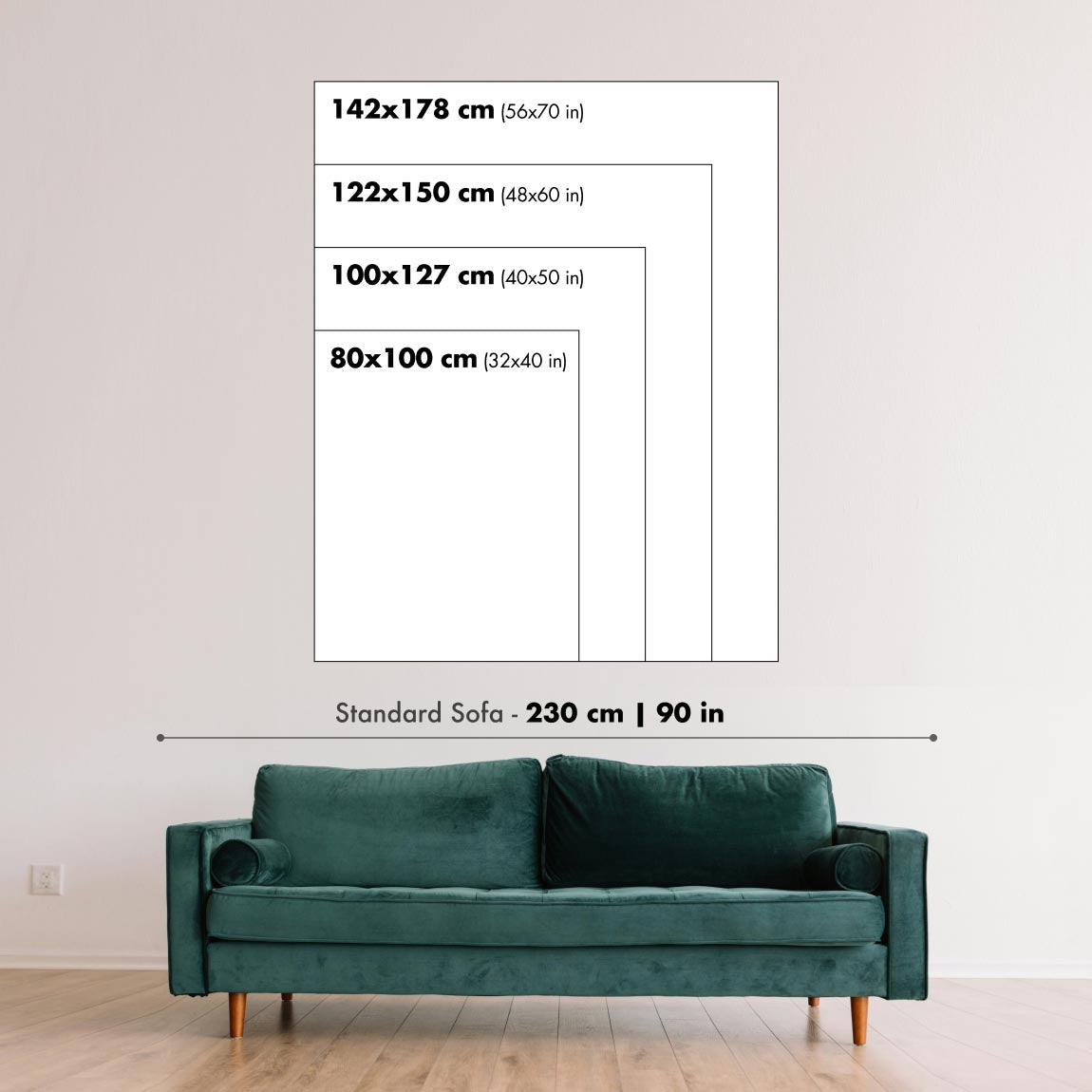
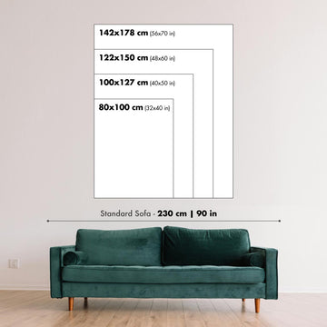
Artwork can feel intimate at smaller sizes and dramatically more architectural at larger ones. Use the room preview, model image and size guide to see how the proportions and scale will work in your space.
If you need an exact size, specialist framing or help planning a larger display, ask our workshop for advice.
The model in the listing images is holding the 24x36in (60x90cm) version of this art print.
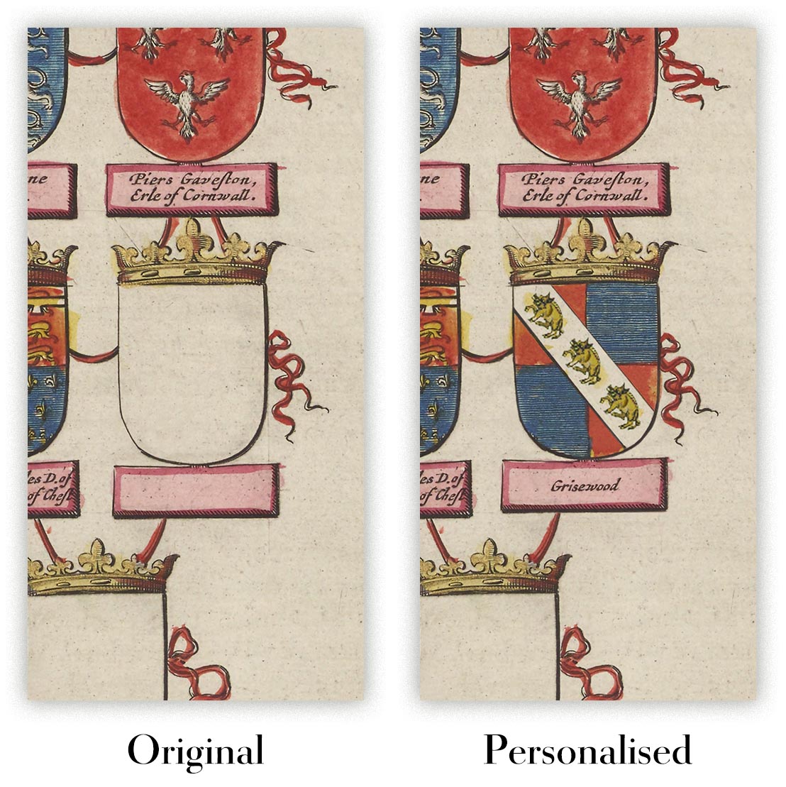
Where personalisation is available, you can add a short title or dedication, or one considered visual detail. See examples of personalised artwork.
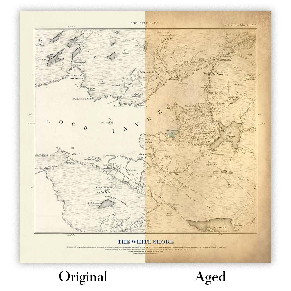
Choose Original to retain the colour and character of the source artwork, or Aged for a warmer, more antique appearance. See examples of our Aged artwork.
Every piece is produced to archival standards using fade-resistant pigment inks on acid-free matte art paper. Choose an art print, framed art print or framed canvas using the finish options above.
Framed art prints use crystal-clear optical acrylic for excellent clarity, lower weight and safer delivery than glass. Each piece arrives professionally framed and ready to hang.
Selected artworks can be produced at statement sizes up to 3 metres (10ft). Custom sizing and specialist framing are also available. If the exact option you need is not listed, contact our workshop.
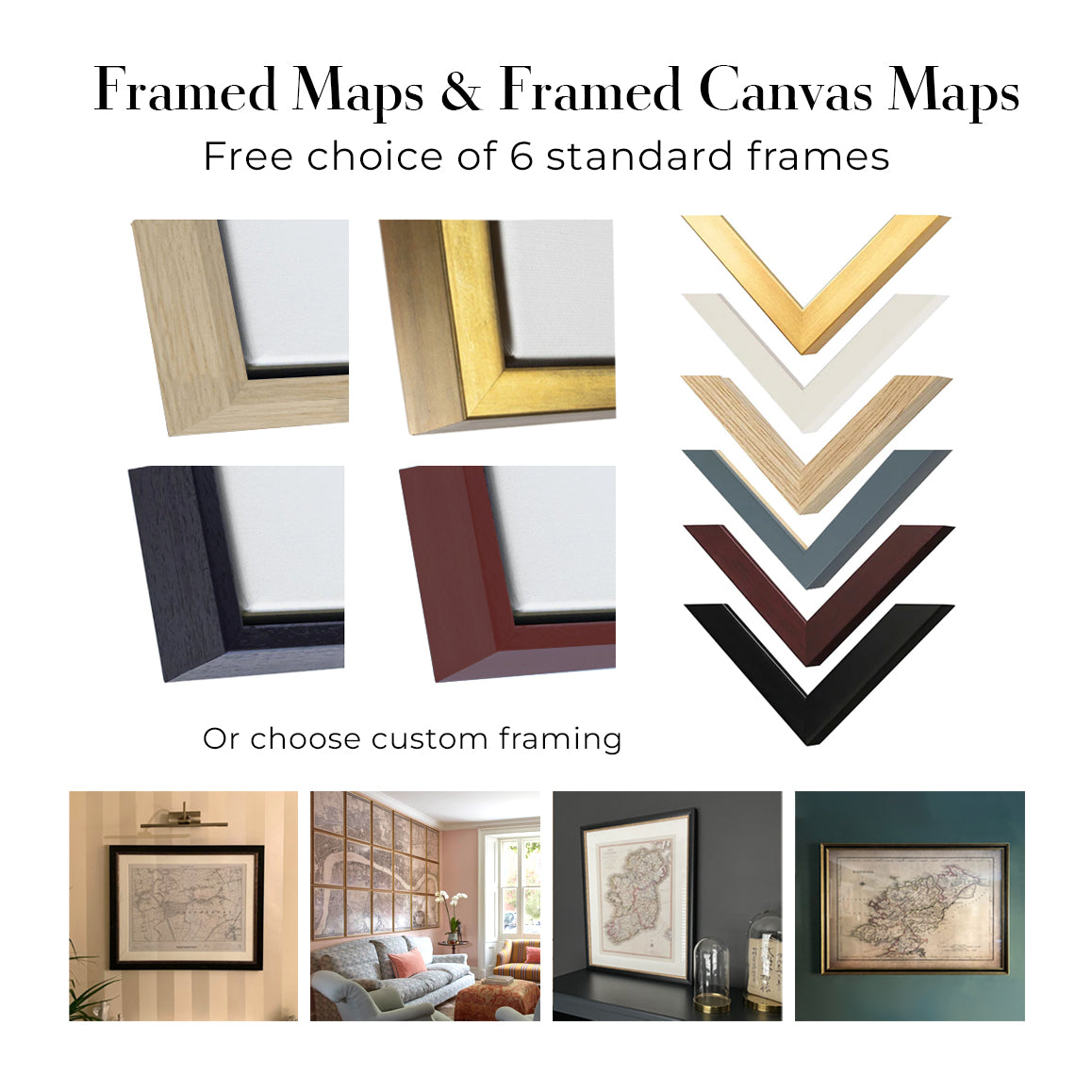
This artwork is also available as a float framed canvas, sometimes known as a shadow gap framed canvas or canvas floater. The work is printed on artist's cotton canvas and then stretched over a handmade box frame. We then "float" the canvas inside a wooden frame, which is available in a range of colours (black, dark brown, oak, antique gold and white). This is a wonderful way to present an art print without glazing in front. See some examples of float framed canvas art and explore the differences between my different finishes.
Leonetto Cappiello’s Angelus. Liqueur des Salésiens de Dom Bosco, created in 1911, turns a simple advertising premise into a piece of vivid visual theatre. A monumental golden bell hangs against a field of deep blue, while a red-robed figure reaches upwards in the act of ringing it. The emphatic difference in scale makes the bell seem to loom over the scene, its polished highlights and curved body set against the flatter, more saturated treatment of the figure. Gold, scarlet and blue meet in sharply separated areas of colour, allowing the design to register almost instantaneously.
Italian-born and based in Paris, Cappiello was among the defining figures of early twentieth-century poster design. Rather than filling his compositions with detailed descriptions of a product, he typically isolated a single memorable motif against a dark or uncluttered ground. Such images were conceived for the speed and distraction of the modern street, where clarity, colour and an unusual silhouette mattered more than close reading. Here, the sounding bell provides a direct visual counterpart to the name “Angelus”, while the poster’s lower inscription identifies the drink’s association with the Salesians of Don Bosco.
A closer look
The bell commands the upper part of the composition. Its broad golden surface is modelled with bands of light and shade that suggest weight, curvature and a reflective metallic sheen. Against the almost uniform blue, it appears less like an object placed within a conventional setting than an emblem suspended in graphic space. This deliberate absence of scenery concentrates attention on the physical action below: the robed figure leans and stretches towards the bell, converting what might otherwise have been a static arrangement into an energetic upward movement.
Cappiello’s handling of the figure is economical but expressive. The intense red garment gathers into dark folds, and the matching hat helps to form a compact, recognisable silhouette. The body’s diagonal thrust counters the bell’s rounded mass, while the asymmetrical placement of the figure towards the lower left prevents the design from becoming rigid. The implied ringing is conveyed not through elaborate narrative detail but through posture, scale and the tension between the figure and the enormous object overhead.
Typography is incorporated as part of the colour structure rather than treated as an afterthought. “ANGELUS” appears in bold yellow lettering, visually related to the gold of the bell, with “LIQUEUR” presented below in a smaller but still conspicuous form. At the foot of the poster, a green band carries the words “DES SALÉSIENS DE DOM BOSCO”. Its cooler, softer colour distinguishes the explanatory line from the main spectacle above. Cappiello’s cursive signature, placed discreetly at the lower right, forms a final, more intimate mark within a design otherwise built for public visibility.
Context and significance
By 1911, the commercial poster had become a conspicuous element of European urban culture: an art of walls, kiosks and thoroughfares, competing for attention amid traffic, shopfronts and other printed announcements. Cappiello’s response to this crowded environment was radical simplification. His advertisements were often organised around a single figure, creature or object whose distinctive shape could remain in the memory even after the wording had been forgotten. The method helped move poster design away from densely narrated scenes towards the concise visual language of modern branding.
Angelus demonstrates that approach with particular economy. The product itself need not dominate the scene; instead, its name is transformed into an unforgettable pictorial conceit. The bell, the ringing figure and the commanding lettering work together as one sign, while the limited palette preserves clarity across the entire vertical composition. The result is both period-specific and strikingly direct: an advertisement whose persuasive force lies in its ability to reduce a name to colour, movement and silhouette.
Choosing the right size and finish
Artwork can feel intimate at smaller sizes and dramatically more architectural at larger ones. Use the room preview, model image and size guide to see how the proportions and scale will work in your space.
If you need an exact size, specialist framing or help planning a larger display, ask our workshop for advice.
The model in the listing images is holding the 24x36in (60x90cm) version of this art print.
Where personalisation is available, you can add a short title or dedication, or one considered visual detail. See examples of personalised artwork.
Choose Original to retain the colour and character of the source artwork, or Aged for a warmer, more antique appearance. See examples of our Aged artwork.
Every piece is produced to archival standards using fade-resistant pigment inks on acid-free matte art paper. Choose an art print, framed art print or framed canvas using the finish options above.
Framed art prints use crystal-clear optical acrylic for excellent clarity, lower weight and safer delivery than glass. Each piece arrives professionally framed and ready to hang.
Selected artworks can be produced at statement sizes up to 3 metres (10ft). Custom sizing and specialist framing are also available. If the exact option you need is not listed, contact our workshop.
This artwork is also available as a float framed canvas, sometimes known as a shadow gap framed canvas or canvas floater. The work is printed on artist's cotton canvas and then stretched over a handmade box frame. We then "float" the canvas inside a wooden frame, which is available in a range of colours (black, dark brown, oak, antique gold and white). This is a wonderful way to present an art print without glazing in front. See some examples of float framed canvas art and explore the differences between my different finishes.
Many of our maps and art prints are chosen as thoughtful gifts for homes, offices, studies and meaningful places.
Choose a framed option for the easiest ready-to-hang gift, or choose an unframed print if the recipient may prefer to select their own frame.
We make orders locally in 24 countries around the world, so gifts can often be produced close to the recipient. This helps them arrive faster, travel more safely, and avoid customs or import duty surprises.
- We can deliver directly to the recipient
- Framed pieces arrive ready to hang
- Unframed prints are carefully packed in a strong protective tube
- Almost every order is made locally, for faster, safer gifting
- 90-day returns give the recipient time to decide
If you are not sure what to choose, please contact us. We can help you pick the right map, size, finish or delivery option.
Most orders are made locally and delivered in around 2–3 working days, depending on the product, size and destination.
We print and frame maps and artwork in 24 countries around the world, so your order is usually made close to you or your recipient. That means faster delivery, less time in transit, and no customs or import duty surprises.
Personalised and customised pieces usually take an extra 1–2 working days, because we prepare your design and send it to you for approval before printing.
Very large framed orders can take a little longer, as they need extra care in production and delivery.
Every order is carefully packaged: unframed prints are sent in a strong protective tube, while framed pieces are securely packed with protective materials around the frame.
If you need your order by a particular date, please contact us before ordering. We’ll check the best production route and delivery option for your location.
Express delivery is available at checkout for most countries. Next-day delivery is available in the UK, US, Singapore and the UAE.
Your order is covered by our 90-day returns policy and 10-year guarantee.
Our standard frame is a gallery-style black ash hardwood frame, with a simple, modern look. It is approximately 20mm (0.8in) wide. You can also view some lovely customer photos of framed maps and art.
We use super-clear acrylic glazing, also known as Perspex or Acrylite, instead of traditional glass. It is lighter, safer, and has lower reflectivity, giving the artwork a clearer, cleaner appearance.
Six standard frame colours are available at no extra cost: black, dark brown, dark grey, oak, white, and antique gold. Custom framing and mounting/matting is also available for customers looking for something more specific.
Most maps, art prints, and illustrations are also available as a framed canvas. We use matte cotton canvas, stretch it over a sustainably sourced wooden box frame, and then float the piece within a wooden outer frame. The finished result is beautifully presented, with no glazing between you and the artwork.
All frames are supplied ready to hang, with either string or brackets fitted to the back. Very large frames will include heavy-duty hanging plates and/or a mounting baton. If you have any questions, please get in touch.
We can also supply old maps and artwork on canvas, foam board, cotton rag, and other materials.
If you would prefer to frame your map or artwork yourself, please read our size guide before ordering.
We work with interior designers, hospitality businesses, property professionals, offices and corporate buyers on individual pieces and larger coordinated projects.
This artwork can be adapted for a particular wall, room or project, and our workshop can help coordinate the dimensions, material and framing before production.
- Exact, oversized and made-to-measure dimensions
- Custom framing, mounting and alternative materials
- Coordinated pieces for several rooms or locations
- Art personalisation, to adjust the colour and style of the piece
- Art and framing guidance from our workshop
- Local production for projects around the world
Every restored art print begins with the original artist’s work—never an AI-generated replacement.
Our London studio works from carefully selected source material from museums, libraries, archives and private collections. We restore age-related damage, faded colour and imperfect reproduction while preserving the artist’s composition, brushwork, line, texture and period character.
We do not use generative AI to redraw, reinterpret or invent the artwork. Digital restoration is used only to recover and reproduce the original work as faithfully as possible.
Once restored, the master artwork is prepared for your chosen size and finish. Your piece is then printed and, where selected, framed close to its delivery destination.
Our giclée art prints use acid-free 200gsm archival matte paper and fade-resistant pigment inks for a rich, museum-quality finish. Framed art prints use crystal-clear optical acrylic and arrive ready to hang.
Framed canvas and specialist cotton-rag editions are also available. Learn more about our materials and finishes.
We’ve been restoring and producing maps and art prints since 1984, and we stand behind every piece.
Every order is covered by our 10-year guarantee and damage-free delivery guarantee. If your piece arrives damaged, we’ll replace or remake it free of charge. If anything else isn’t right, contact our workshop team and we’ll put it right promptly.
See our returns and refund policy for full details.


